


Figural cameos and lovely lettering!
Richard D. Sheaff:
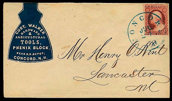
Some of my favorite cameos are those where the design is made to look like the product, profession or industry it advertises. These “figural” or “shaped” cameo designs are actually quite scarce. I have documented only 250 out of 5,500+ cameo designs known — that’s less than 5% of the total.
In figural cameos, the advertising text is placed within a design that resembles the product it advertises. Examples of these would be padlocks, kegs, water pitchers, boots, books and many others. The most commonly found are books (opened or closed) for booksellers, publishers and stationers; padlocks, anvils, axes, saw blades and other tools for hardware merchants and agricultural implement dealers; mortar & pestles for druggists, etc…
Source: Words and Eggs